
THE BOURBON GOSPEL
Rebrand & Launch
-
The Bourbon Gospel began as a bold reinvention of a space the market had already moved on from. A previous restaurant had closed in the same location, leaving behind more than an empty building, it left a perception problem. For the new concept to succeed, it had to immediately and unmistakably communicate that this was not a reopening, but an entirely new vision.
At the same time, the idea behind The Bourbon Gospel didn’t fit into a conventional hospitality mold. It was built around the culture of songwriting, the kind of place where great food, great drinks, and the stories behind the songs could live in the same room. The brand needed to feel deeply connected to that creative community while still carrying the weight and polish of a destination restaurant.
The visual identity became the vehicle for that shift. It had to signal new ownership, new energy, and a new purpose for the space. It had to feel authentic to musicians and songwriters without slipping into nostalgia or cliché. And it had to create a presence strong enough to replace the memory of what had been there before.
Our work focused on building a visual language that could hold all of that tension — something soulful and refined, rooted in craft, and capable of carrying the concept consistently from first impression to in-room experience.
-
Brand Execution
Creative Direction
-
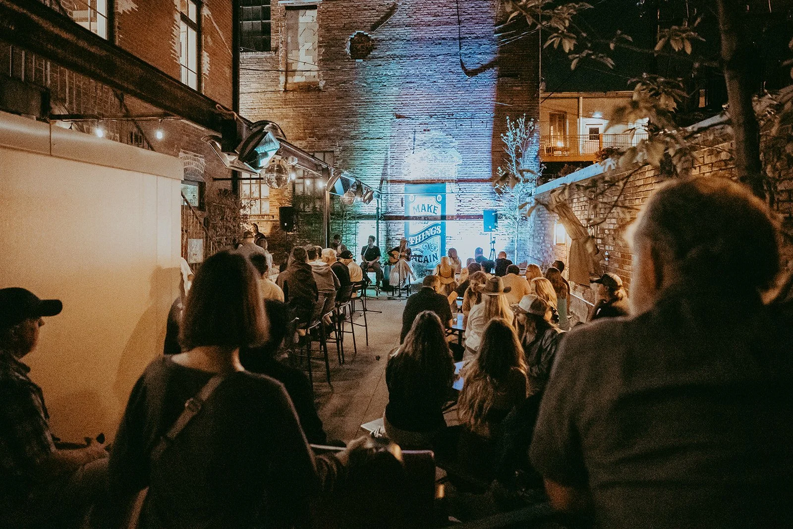
The new identity gave Bourbon Gospel a clean break from the past and a clear presence in the market from day one. What had previously been viewed as a failed location was reintroduced as a destination, a place with its own voice, its own energy, and a concept people immediately understood and wanted to experience.
From opening, the response was immediate. Packed nights, a steady flow of first-time guests, and consistent local buzz signaled that the perception of the space had been fully reset. Instead of fighting the history of the location, Bourbon Gospel quickly became known for something entirely its own, an atmosphere where great food, bourbon, and songwriting culture intersected.
The brand created instant differentiation. Rather than feeling like another neighborhood restaurant, Bourbon Gospel entered the scene with the character and confidence of an established venue. The visual system carried across every touchpoint, from signage to menus to in-room details, reinforcing the experience and making the space feel cohesive and intentional.
Just as importantly, the identity resonated with the music community it was built for. Artists embraced it. Guests connected with it. And the restaurant gained momentum not just as a place to eat and drink, but as a place people wanted to be part of.
The result was more than a new look, it was a shift in perception, a full room on a regular basis, and a brand that positioned Bourbon Gospel as a standout in a highly competitive hospitality market.
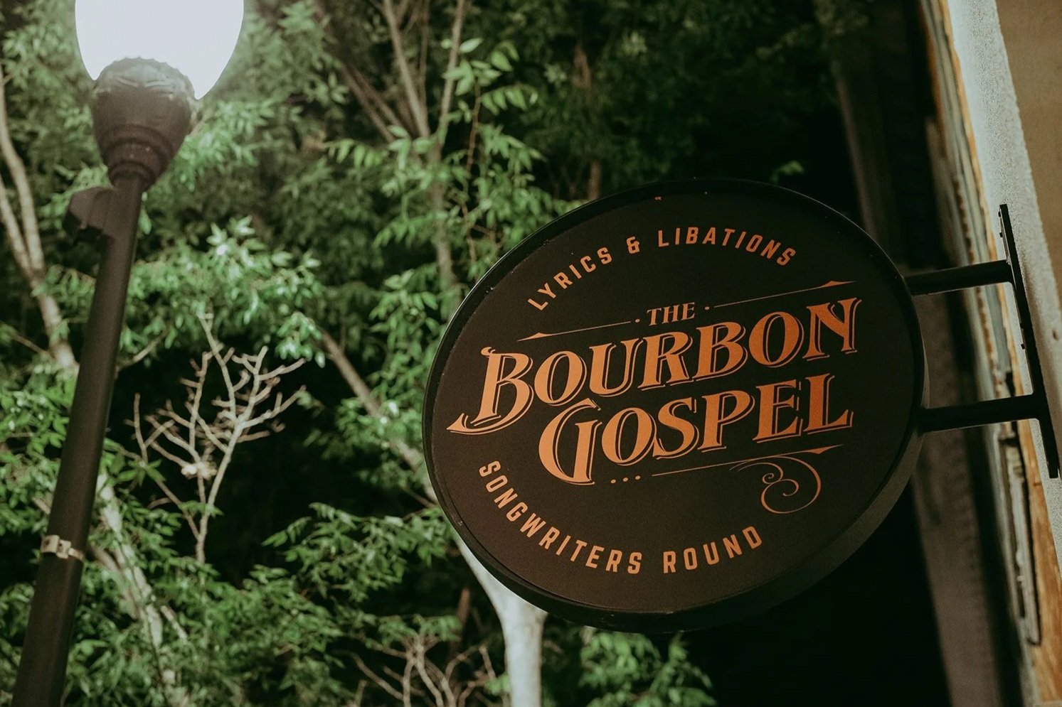
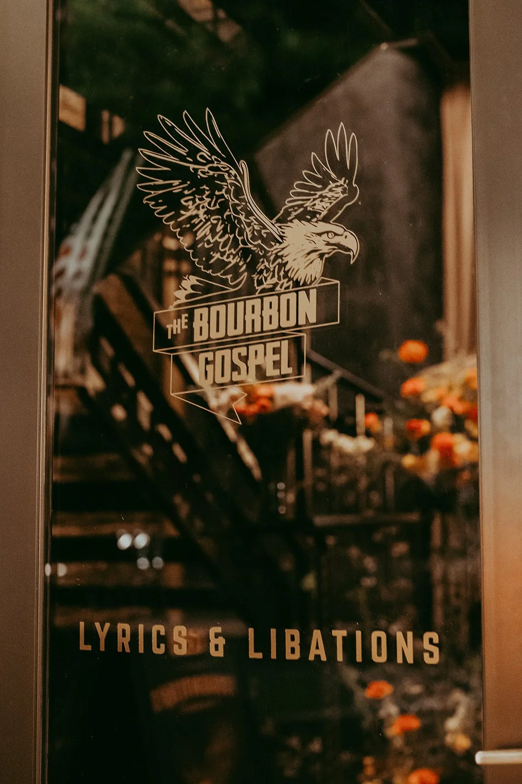
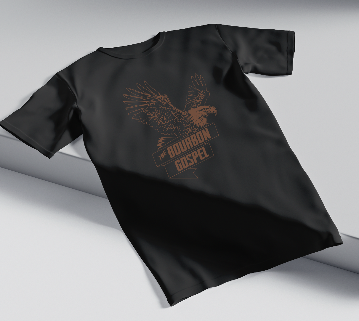
Primary Mark
Secondary Mark
Tertiary Mark
Why a logo system?
A single logo isn’t always enough, especially in experiential spaces. A logo system allows the brand to adapt across signage, menus, merchandise, and digital platforms without losing consistency or impact. By using a family of marks, the identity can scale, shift, and meet each moment appropriately, creating a cohesive experience rather than forcing one logo to do every job. The result is a brand that feels intentional everywhere it shows up and is built to last as the business grows.

Photography by Thayne Media.